The Story Behind the Brand
The decision to rebrand WMCD to Youth for Change may have seemed like a quick announcement, transition, or update. But behind the scenes, months (and even years) of strategic planning, thoughtful conversations, surveys, iterations of visual identity, and hours of debate stood behind the transition into our newest chapter.
In the earliest days of these conversations, an important question sat at the forefront of our minds: what are we trying to do?
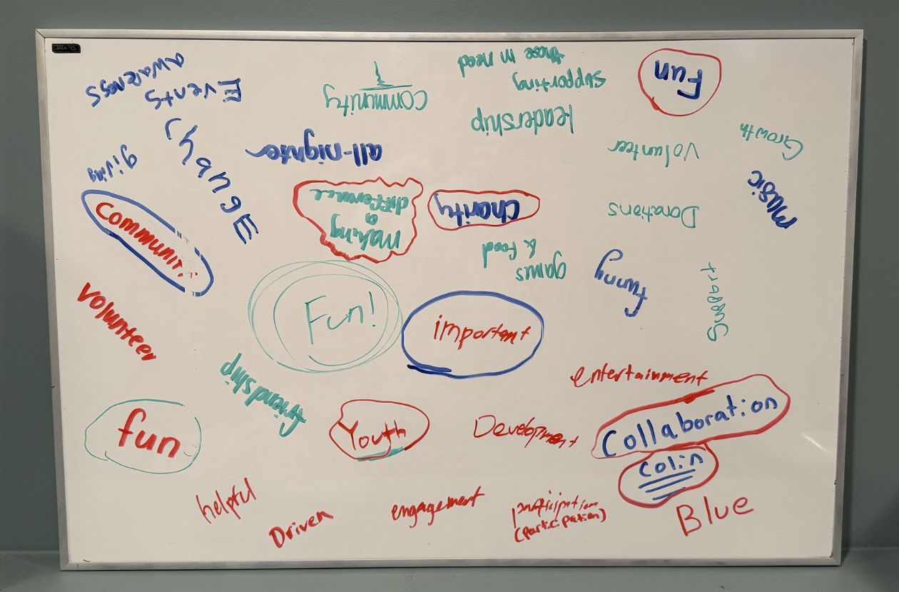
We sat down with our Youth Team and asked them — what words best describe our organization?
It was an important distinction to make — whether we were focused on supporting local nonprofits, hosting a huge annual event, helping youth build on their leadership skills, or teaching youth the importance of giving back. It was the central theme of our conversations with our Steering Committee, Youth Team, and Board of Directors as we took the time to have one-on-one conversations with many of our volunteers who power our work. As we moved into the brainstorming phase of the process, we wanted to make sure our mission statement represented our ultimate goal — the thing we wouldn’t just work towards now, but for many years to come.
After months and months of thought, conversation, and debate, we landed on our new mission statement: empower youth to lead through volunteerism by connecting them with opportunities to serve and give back, help them develop essential skills, and create meaningful impact in their communities.
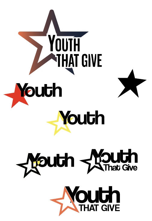
Visual mockups during our rebrand.
Youth That Give was just one idea for our new name!
Now, we just needed a name.
This was the fun part! We got to brainstorm, throw out ideas, and collaborate to come up with something that represents our future. And trust me when I say — there were so many ideas! Whether it was “The Ripple Effect” or “Youth That Give”, we tried coming up with names that featured the word ‘youth’ and even some more abstract ideas. Once we had narrowed it down to three finalists, it was time to go straight to the people who make this all possible: the youth. In June, we sent a survey out and received nearly two hundred responses from real students in Westfield and beyond who voiced their opinion on our name options and paths for our visual identity. Thankfully for us, the response was clear: Youth for Change.
And even though the votes on the visual identity were split fairly evenly, we took this opportunity to go back to our Youth Team and get some working ideas through a casual focus group meeting. We showed them the ideas, had them vote, and most importantly, we asked them what stands out about our organization above other opportunities they have. They made it very clear: it was the energy. It was the opportunity to take their energy and turn it into something real and meaningful, rather than just volunteering to fulfill a requirement or because it was the “right thing to do.” Our favorite feedback was that the capital letters in our logo mockups felt too aggressive — a reflection of the fully lowercase texting style teens use today.
So, we ran with it. How could we visualize the youth’s energy, but make it feel like the same organization we know and love?
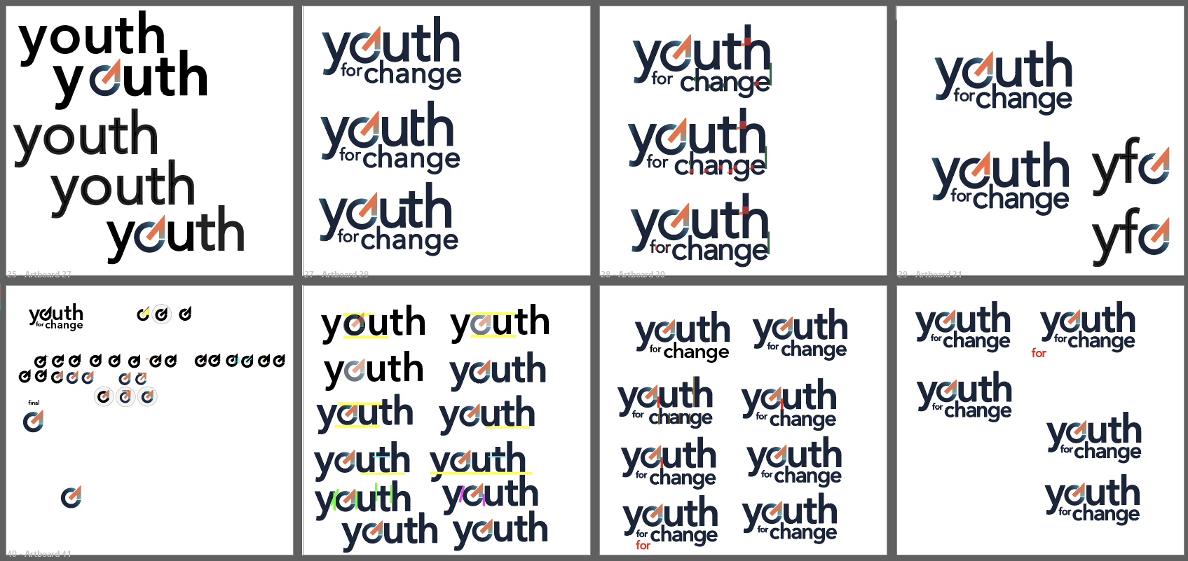
Iterations of our final YFC logo.
Introducing, the clarrow. As we tried to find inspiration for our logo, we combined the icon of a clock (representing our 25-hour all-nighter event) with an up arrow, showing that we are trying to elevate youth’s skills and support our community needs. The simple icon fit well into the “o” shape of the word youth — and sure enough, our new logo was born.
The gradient represents the energy. The lowercase letters representing the way young people communicate. The name representing feedback from hundreds of students. The arrow to represent our goals. The abstract clock shape, paying homage to the event that started this all.
As we showed this to our volunteers and youth team, the feedback was overwhelmingly positive. The new brand has given us the opportunity to harness what we know and love while showcasing what we have planned for the future. And we’re so excited to do just that!
It’s so important that our new brand — our name, logo, visual identity and goals — is a product of so many thoughtful conversations, pieces of advice from young people, and an honor to the name that started us off. We are so proud of how it has turned out, and we can’t wait to continue making an impact in our community together.